Jump to content


Photo

Skin


  • Please log in to reply
19 replies to this topic

#1 Cule

Cule
  • Members
  • 762 posts

Posted 19 May 2007 - 10:23 PM

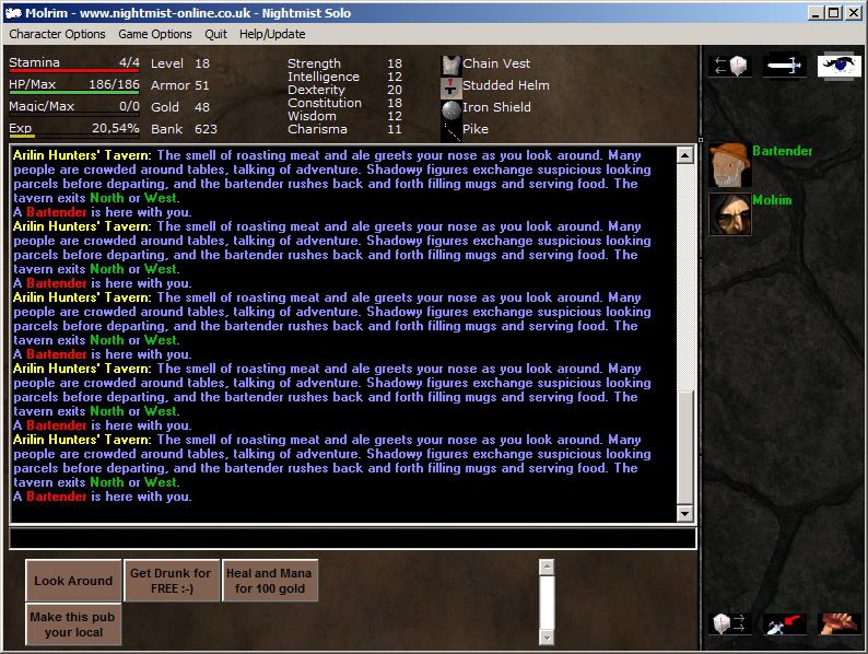
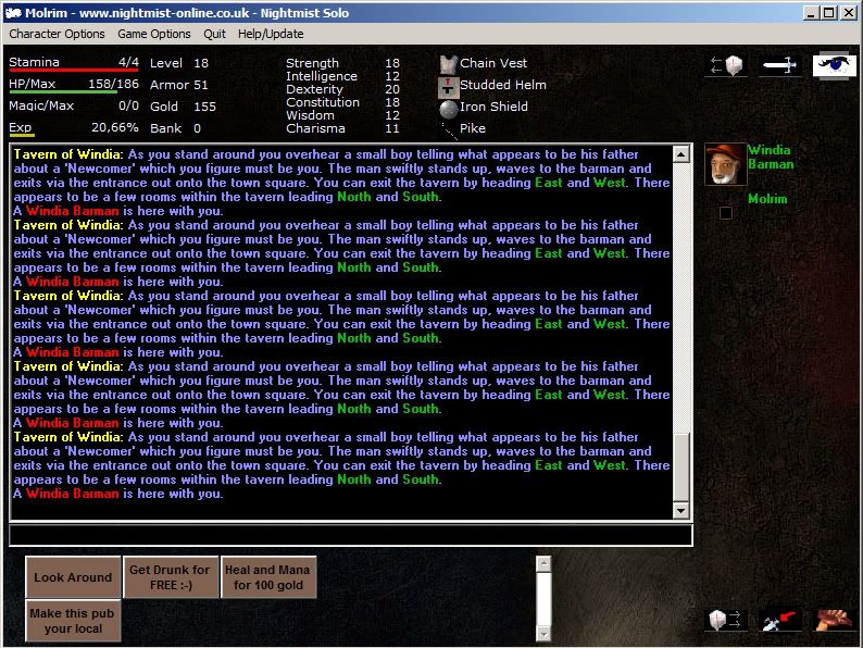
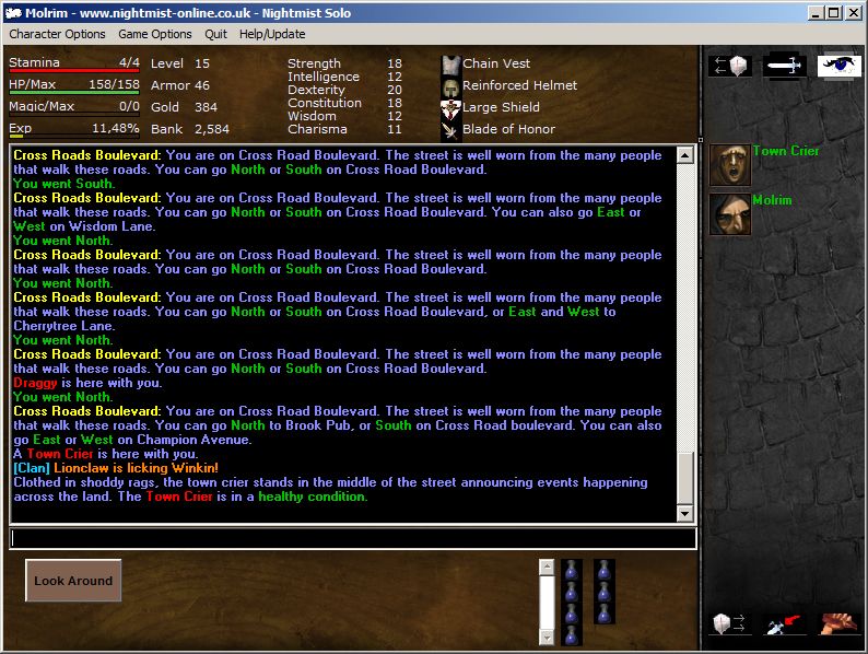
Did some tweaks to my compact skin, plus a new background.

Posted Image

Download

I probably should have spent more time on the stone pavement texture, instead of just slapping it there, but decided it works fine as is.
The portraits are a small project i set myself to counter boredom, but more about them some other time! Maybe.

H0pe u likez 1t.

(Did i get that right?)

:)

Edited by Cule, 19 May 2007 - 10:25 PM.


#2 Cule

Cule
  • Members
  • 762 posts

Posted 21 May 2007 - 07:49 AM

As i mentioned, im doing some icons, mainly the player portraits. There's alot to do, so i dont know if i manage to keep my interest in this task to finish them all. Though ill try.

I didn't remember nightmist having rage pictures aswell. Double's the work right there, but anyway ...
I though i might aswell give you one ahead ...

This replaces the blue hooded thieflike icon ( or you can replace anything you want ... my suggestion is better though. Heh.)

Normal, replaces 1256

Posted Image

and here's Johnny. Replaces 1927 (rage)

Posted Image

Download them and rename them to those numbers and drop 'em in the gfx folder.
For best result's use a skin that has 40*40 room icon size. The skin above will do just fine. I would also suggest using the client windowed.
The clientside stretching and resizing to other than the icon's normal size tend's to "trash" them.

I'll .rar and throw a bigger bunch in here when im done with them. Might take awhile or forever even.

Enjoy.
#3 Äññöÿäñcë

Äññöÿäñcë
  • Members
  • 2132 posts

Posted 25 May 2007 - 10:46 PM

I like that picture, looks good.
Disaster ingame.

#4 Cule

Cule
  • Members
  • 762 posts

Posted 28 June 2007 - 02:21 PM

Thank you.

You know what i think? I think nightmist has too many player icons.

Anyhoo ...


Elf male druid
Posted Image

Elf female druid
Posted Image

Gnome
Posted Image

Town cryer
Posted Image

Do with them whatever you want.
They are not the best i could do, but serves well to test what could be possible to achieve with a little more effort.
I'm basically testing how would nightmist look with icons that match each other and the rest of the user interface.

Edited by Cule, 28 June 2007 - 02:33 PM.


#5 Squee

Squee

    Sorcerer

  • Members
  • 1810 posts

Posted 28 June 2007 - 09:17 PM

I'm basically testing how would nightmist look with icons that match each other and the rest of the user interface.

Possibly the sexiest idea ever.
Posted Image

#6 Cule

Cule
  • Members
  • 762 posts

Posted 22 August 2007 - 02:46 PM

Sex has nothing to do with this.


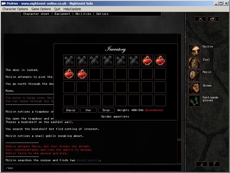
Further experimentation however lead up to this shameful mockup.

Posted Image
The inventory icons are found using google, the textures from a free texture site.

Edited by Cule, 22 August 2007 - 02:52 PM.


#7 Scripto

Scripto

    ~teh Scripto

  • Game Staff
  • 1628 posts

Posted 22 August 2007 - 03:43 PM

Wait.. what is that!?!

sorry lookin at that just confused me like a mofo...
For every minute you remain angry, you give up sixty seconds of peace of mind.

Ingame:
Scripto (Staff)
Kannabis (Mortal)

#8 Cule

Cule
  • Members
  • 762 posts

Posted 22 August 2007 - 04:12 PM

Wait.. what is that!?!

sorry lookin at that just confused me like a mofo...


If you could tell me what confuses you about it?

In short.
It's a concept mockup. Just trying to see what nighmist would look like with more effort put in the visuals, with abit more consistancy and whatnot.

Or maybe you are referring to the layout, which probably is abit confusing as it isnt entirely thought out.
To answer the most obvious distraction: the inventory window is invoked using a command "/inv" in that picture and the idea was that its not a "solid" part of the main interface to give more room for the text.

The point of the mockup is not to reinvent the interface though, it's just a mere visual experimentation.

#9 Scripto

Scripto

    ~teh Scripto

  • Game Staff
  • 1628 posts

Posted 22 August 2007 - 04:54 PM

Ah.. ya just lookin at that last screen shoot is what confused me.. but makes alittle more sence now.

Does look very intresting, and cool at that tho.
For every minute you remain angry, you give up sixty seconds of peace of mind.

Ingame:
Scripto (Staff)
Kannabis (Mortal)

#10 Woodstock

Woodstock
  • Members
  • 263 posts

Posted 01 September 2007 - 10:17 AM

hey cule, i very much so like this skin, and i did switch that one pic out with the blue hood with yours, and i really enjoy the look and feel of that layout, lots of room for the chat/reading area, and very neat setup up of everything else. the pic also matches well seeing most of my crits use that pic, minus lappa's skull pic >:)

good work tho, i'd like to see some similar layouts with different graphics, but i like this one alot.
When life slips you a Jeffrey, stroke the furry walls.

Lappa/Woodstock on Multi
Dubs/Cold on 1a

#11 Cule

Cule
  • Members
  • 762 posts

Posted 02 September 2007 - 11:16 PM

Thank you.

I made a new background for it.


Posted Image

Click the picture to download


edit:

Did a small enhancing job aswell.

Posted Image -> Posted Image

Yeh it's smaller than the original, just to go with the rest of my icons. :P

Edited by Cule, 02 September 2007 - 11:50 PM.


#12 Cule

Cule
  • Members
  • 762 posts

Posted 05 September 2007 - 11:27 PM

I made a simple website for the two skins. :P

http://koti.welho.co.../Stuff/nmskins/

Edited by Cule, 05 September 2007 - 11:30 PM.


#13 Raylen

Raylen

    Your #1 fan!

  • Members
  • 2329 posts

Posted 06 September 2007 - 10:59 AM

This man has talent. Someone give him a job already.


Although I might say that I like teh look of nm as it is. Although perhaps some of the visual changes could be made to nm1a, to further separate it from multi.
+1 post count ggpwnedkthxbai

it's plausible that the SOB hasn't spawned


¯¨:·»Gently spamming the forum since 2003«·:¨¯

#14 Cule

Cule
  • Members
  • 762 posts

Posted 12 September 2007 - 01:51 AM

Texture vomit.

Posted Image
Download


afk icon from the picture above. Works on this skin only. :/
Posted Image

#15 Scripto

Scripto

    ~teh Scripto

  • Game Staff
  • 1628 posts

Posted 12 September 2007 - 02:20 PM

Definally, definally... sweeet
For every minute you remain angry, you give up sixty seconds of peace of mind.

Ingame:
Scripto (Staff)
Kannabis (Mortal)

#16 Demented Kitty

Demented Kitty
  • Members
  • 33 posts

Posted 17 September 2007 - 10:01 PM

:) Is there anyway a skin can be made with skulls on it? or maybe one based on Wiccan beliefs? But make it in the same layout the normal nightmist screen has? If it is not too much trouble.. it would be greatly appreciated. Thankies! <3 :)

Edited by Demented Kitty, 17 September 2007 - 10:04 PM.

Daiquiri/Mogwai on multi.

#17 Cule

Cule
  • Members
  • 762 posts

Posted 17 September 2007 - 10:44 PM

No requests, sorry.

#18 Woodstock

Woodstock
  • Members
  • 263 posts

Posted 21 September 2007 - 06:23 PM

he does it for his enjoyment, not yours, so u best recognize or step off.

<3 cule lol

i love that skin, and the icons you use, i've implemented most of them
When life slips you a Jeffrey, stroke the furry walls.

Lappa/Woodstock on Multi
Dubs/Cold on 1a

#19 Ghost_Wolf

Ghost_Wolf
  • Members
  • 134 posts

Posted 26 September 2007 - 04:00 AM

Nothing like rude flamers on the forum to brighten your day. :)

Other then that very good work.
Link-Nepharious_Niassey (Main)

Love is a 36' carbon tip chainsaw and rib spreaders....nuff said.

#20 Shane

Shane
  • Members
  • 496 posts

Posted 01 May 2008 - 04:35 AM

Very nice work. I like how you have sorted most of the important items in the client to one side. The grahpics are very good work too.

"Before my time is done I will look down upon your corpse and smile!"


1 user(s) are reading this topic

0 members, 1 guests, 0 anonymous users